UCOOK
Sign-up funnel redesign.
Role
UX/UI Designer
Company
Silvertree (UCOOK)
Year
2025
Methods
Mixed methods
3.7%
old completion rate
9.3%
new completion rate
~R1.3M
annual revenue at risk
Customer service data showed users completing what they believed was sign-up, then contacting support expecting deliveries. Over 60 incomplete sign-ups in one week. Retention through the path: 1.43%.
This was not on the roadmap. I initiated the investigation.
The Problem
User pain
- Users confused sign-up with account creation.
- Could not find meals or navigate back.
- Subscription vs on-demand was unclear.
Business pain
- 60+ incomplete sign-ups per week.
- ~R1.3M/year revenue leaking through funnel.
- 56% of first billings 1-5 days post sign-up.
Goals
Validate whether sign-up was a genuine usability and conversion issue worth prioritising
Identify where and why users were dropping out of the journey
Define a clear, measurable happy path sign-up funnel
Reduce incomplete sign-ups and improve confidence around subscription activation and billing
Constraints
No baseline funnel existed for testing.
Billing logic was complex and misaligned with user models.
Earlier payment carried operational refund risk.
Research
Seven stages. Mixed methods.
Customer service interviews
Tracked complaint categories. Flagged incomplete sign-ups.
Internal survey (n=16)
55% flagged unclear communication. Sign-up scored 6/10.
Competitive benchmarking
Marley Spoon, Taste Box, Hello Fresh. Clear step patterns.
Heuristic evaluation
Nielsen's 10. Three theme clusters identified.
Unmoderated testing (Maze)
Blocked. No defined happy path to test against.
Moderated usability testing
Three sessions. Navigation and pricing clarity issues.
Measurement planning
GTM triggers per funnel step. GA, PostHog, heatmaps.
Critical finding
All participants expected to pay immediately. Payment was the task completion signal.
This single insight reshaped the solution.
Insights
Sign-up felt unclear -- users confused subscription activation with simple account creation
Navigation and orientation issues: users couldn't find meal options or return to previous steps
Checkout created confusion around subscription vs on-demand ordering and when payment would occur
All test participants expected to pay immediately, with payment acting as task completion
56% of first billings occurred 1-5 days after sign-up, reinforcing expectation misalignment
No clearly defined baseline funnel existed, preventing effective unmoderated testing
Solution
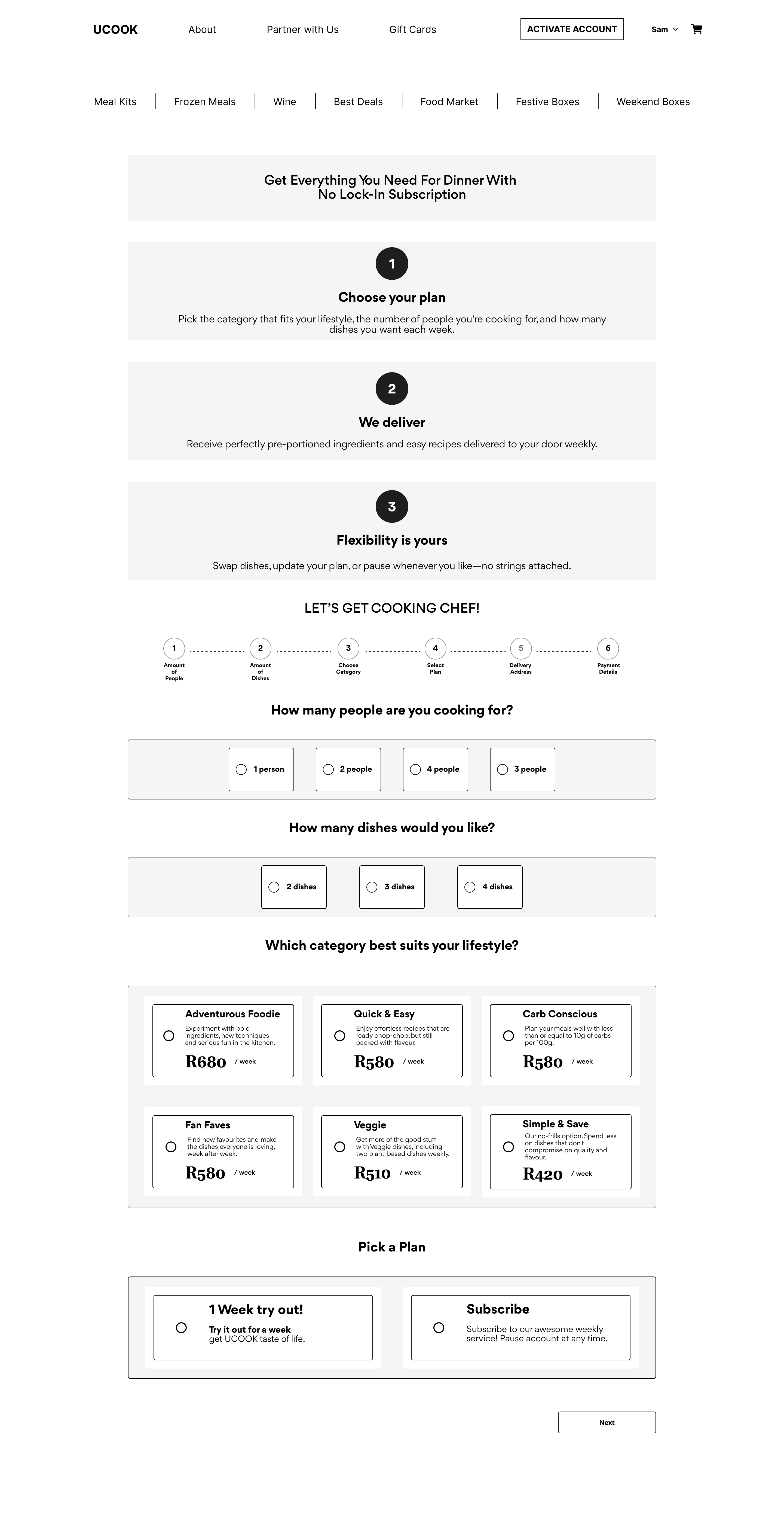
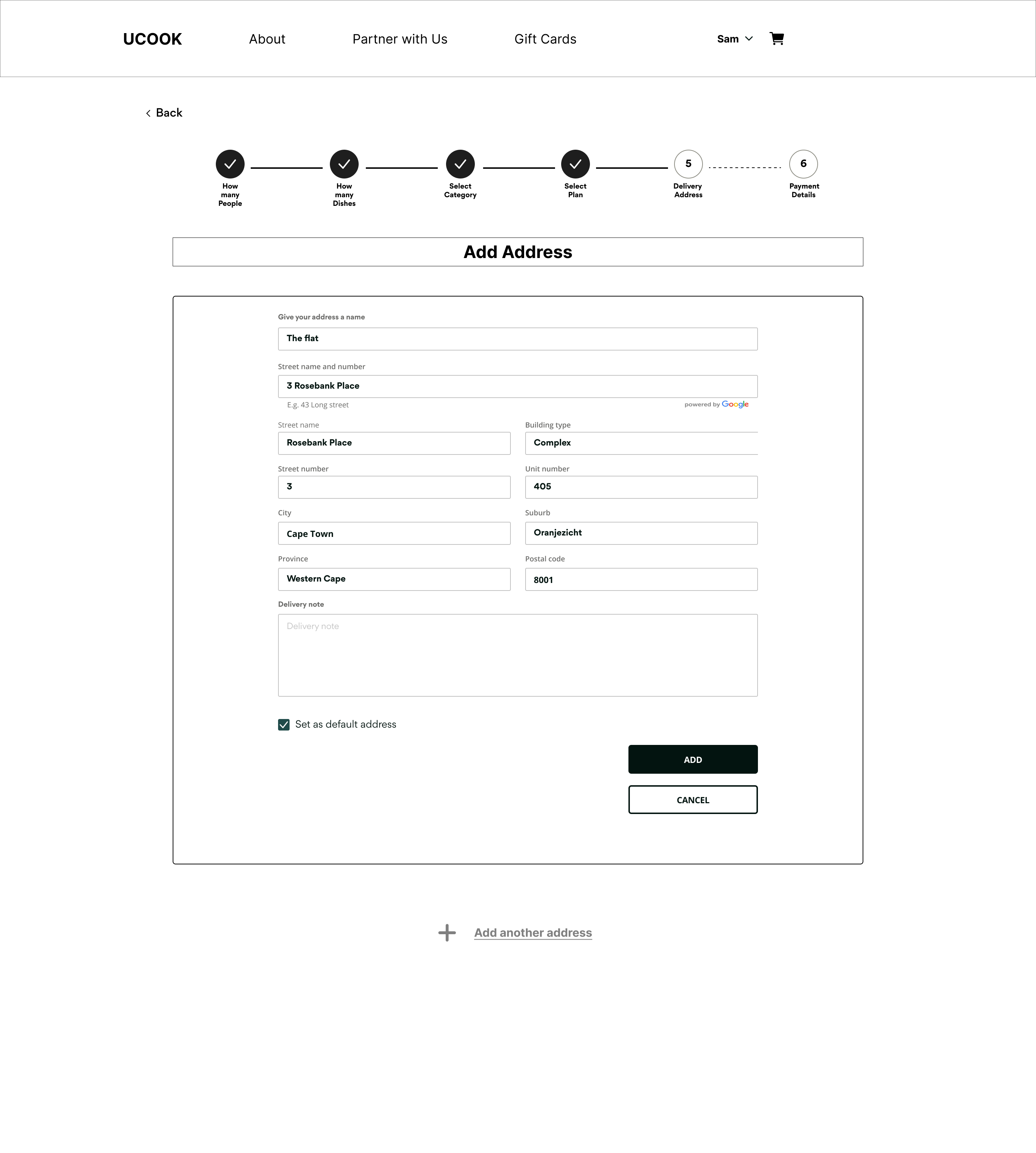
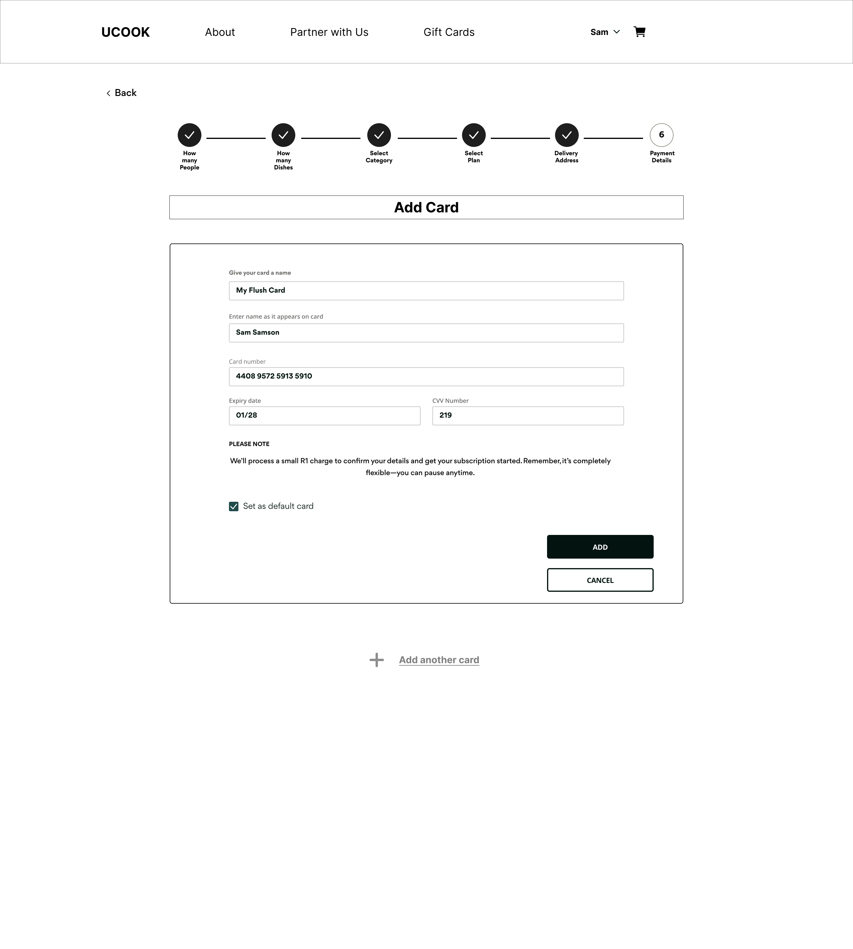
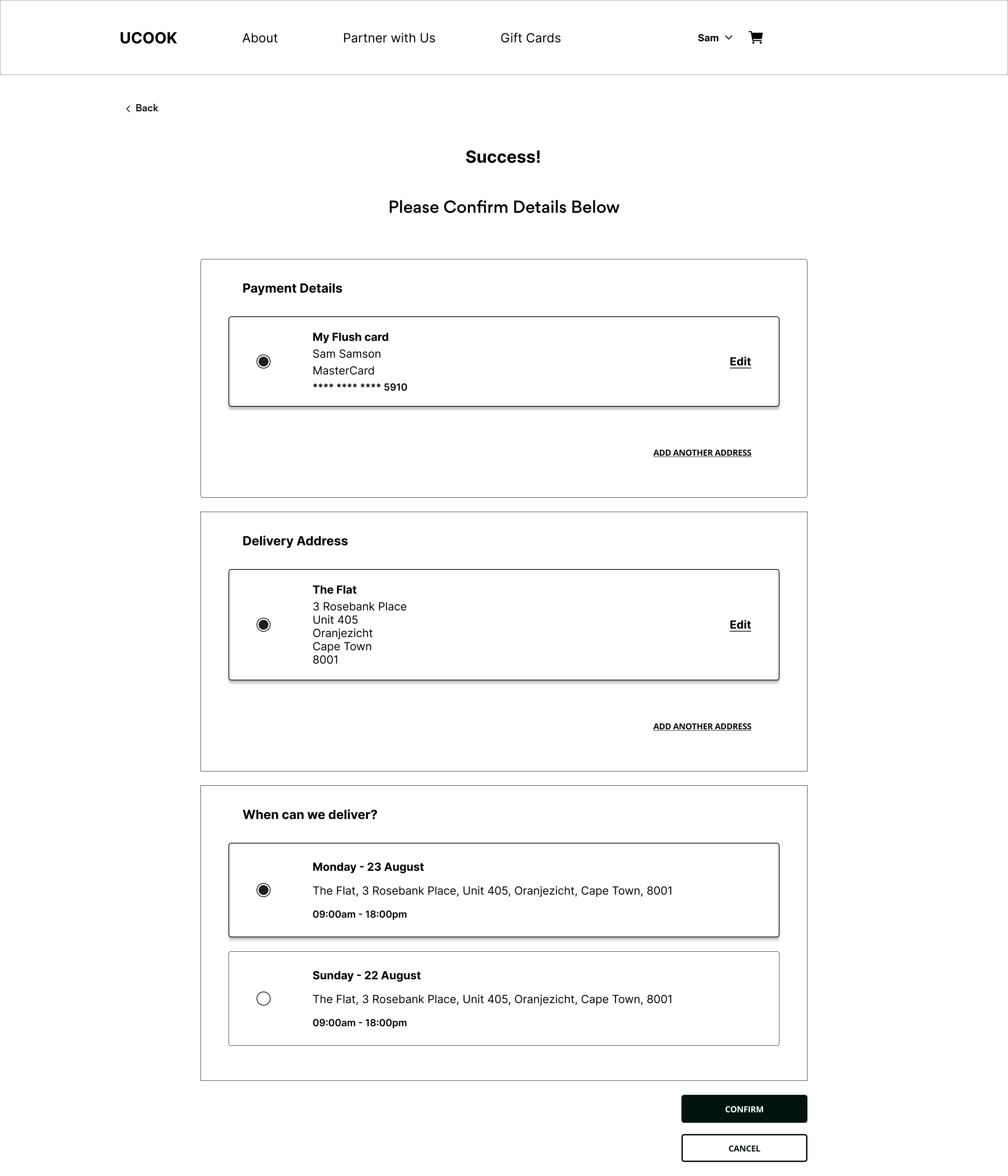
Two workstreams. Quick wins shipped independently. Structural redesign addressed the funnel itself.
Quick wins
Communication, navigation, UI clarity.
Structural redesign
Measurable funnel with payment decision.
Wireframes
Handoff specifications
scrollIntoView()
Step transitions, error states.
Sticky header
Orientation during sign-up.
Form validation
Inline errors. Prevent incomplete submits.
Progress tracking
GTM triggers per funnel step.
Results
Old funnel
3.7%
New funnel
9.3%
+5.6%
Absolute increase. Abandonment at top of funnel reduced from 91.1% to 75%. More users reached later stages.
Pending
- Payment timing decision outcomes.
- A/B testing results.
- Post-release refund and billing impact.
Reflection
Self-initiated research can drive business priorities -- proactively identifying unmet user needs shifted roadmap focus
Form friction on mobile is a strategic revenue issue with outsized effect on conversion and trust
Leading discovery in low-UX maturity environments requires demonstrating value through data, not theory
Mixed methods research builds unshakeable evidence -- combining qualitative with quantitative created a defensible case for change